This is a regular update my Now page. I publish them as a blog post for archive purposes. You can also view all my past now entries.
My goal with my website is to treat it as its own product that keeps evolving and improving over time. I had a thousand ideas I wanted to do when I first started designing the site. I wanted a storefront for digital goods, a native Lego collection page, and a portfolio. But if I were to do all of those at launch, I would have never published the website. Instead, I followed Brian Lovin's Incremental Correctness line of thinking and went with something simple to start.
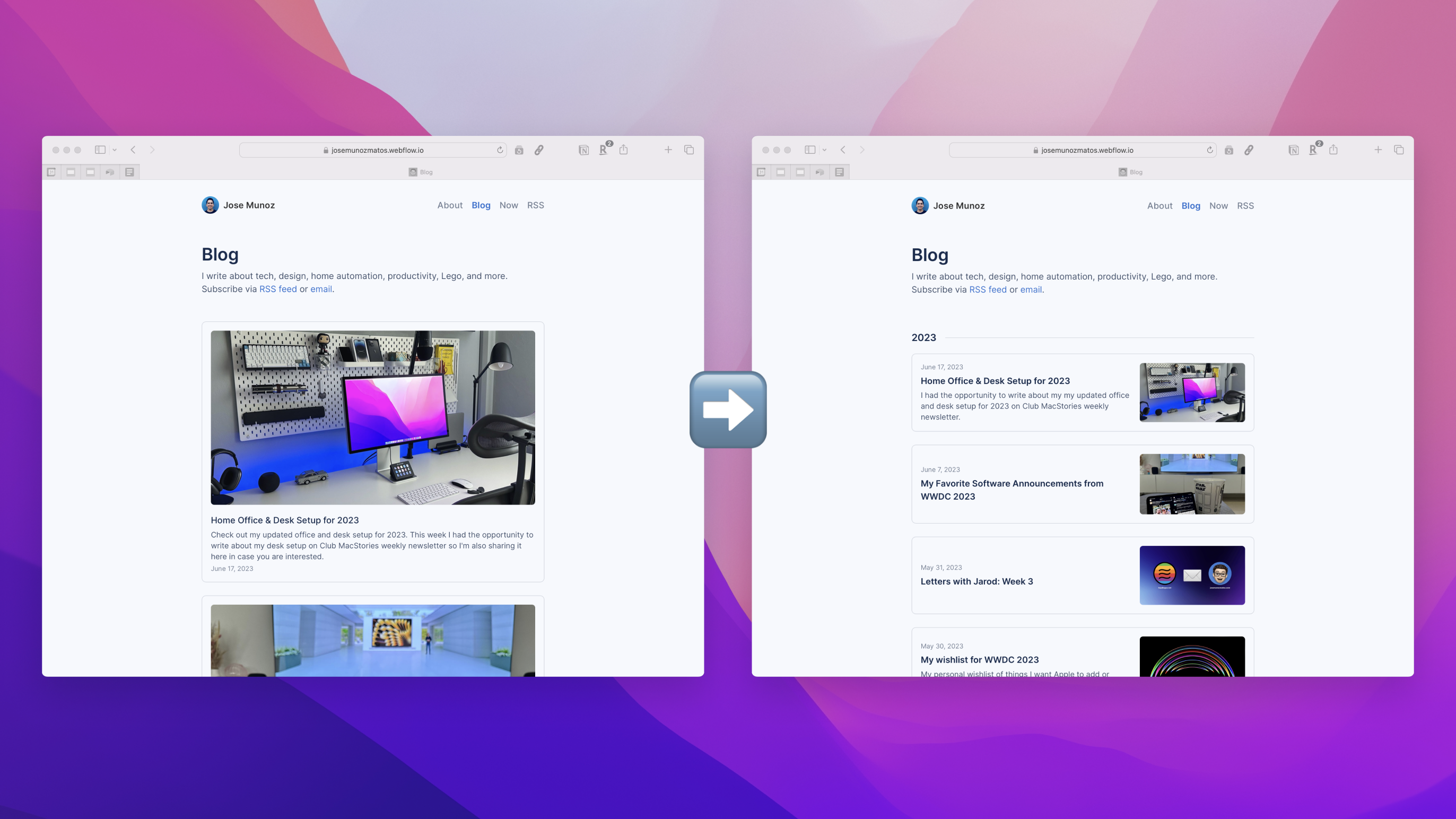
This was just a tiny improvement I had for a while in my Backlog of ideas I keep in Notion. I keep both improvements and new feature ideas. For this one specifically, I've been unsatisfied with how my all Blogs page looked. Initially, I went with a card approach which I still like, but the thumbnail images were just too big. That meant each blog postcard was giant, making the page longer than needed and impossible to skim. It defeated the purpose of a blog archive.
There were a few of the problems I was trying to solve with the redesign.
- Reduce the footprint and density of each blog postcard
- Reduce the length of the page
- Group posts by Year: For now, I went with years, but eventually, I might go
- The postcards need to work with and without featured images
- Also need to work with and without subtitles
Even if it is a side project or a simple one, I like still to use the same typical product design process at work. Discovery, Define, Wireframes/Sketches, visual design, and Dev.
Before & After
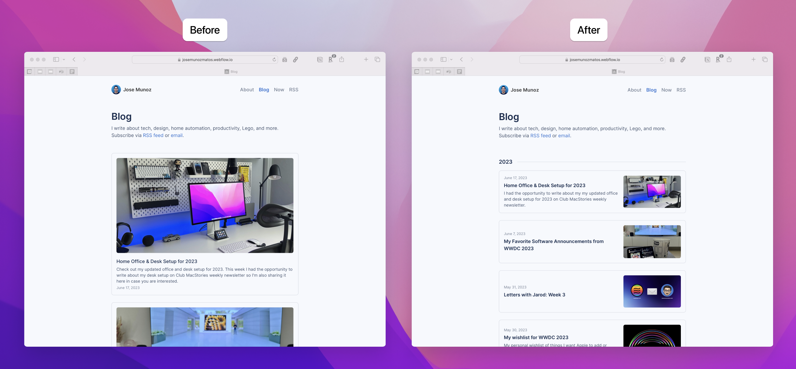
The change is very subtle, but I think it's better than how it was before. I might also consider abandoning the card approach in the future because it is starting to feel a bit too boxy. Still, for now, I'm satisfied with the improved scannability of the page.
Later, I also plan to add tags to the top of the page so people can filter the posts by categories. Also, I might try grouping by month instead of Year, depending on how many blog posts per month I end up publishing.
A quick aside on images on blog post thumbnails
I'm always going back and forth on showing or not featuring images in the Blog posts. I would say that 90% of my favorite personal websites don't include featured images on their All Blogs page. I get why they do it. Having images increases the friction of publishing posts by requiring you to think of and create an image for every post. But most of those sites are more like a micro-blog, where they often write short posts with no images. On my end, I enjoy reading articles with pictures, so that is the type of posts I like to write.
Because of that, I think having featured images on the post thumbnail better sets the expectations for my articles and differentiates my site from others. For once, I will go against Brian Lovin's Reasons you aren't updating your personal site and deal with this extra friction.
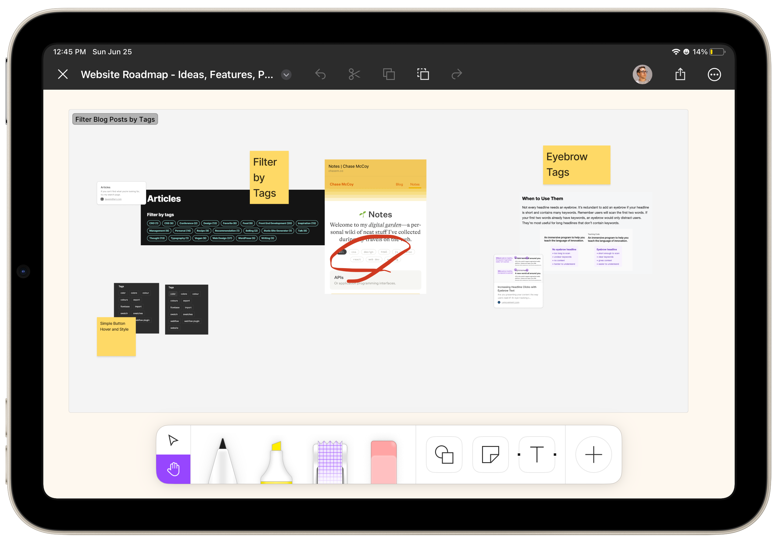
Collecting references

I constantly capture references while doing my morning RRS catchup. I have a handy Shortcut called Check @Desk that sends the screenshot as an email to an account I've reserved, only to show up on my Mac. I then throw everything into a Figma document that I name with the Project's title.
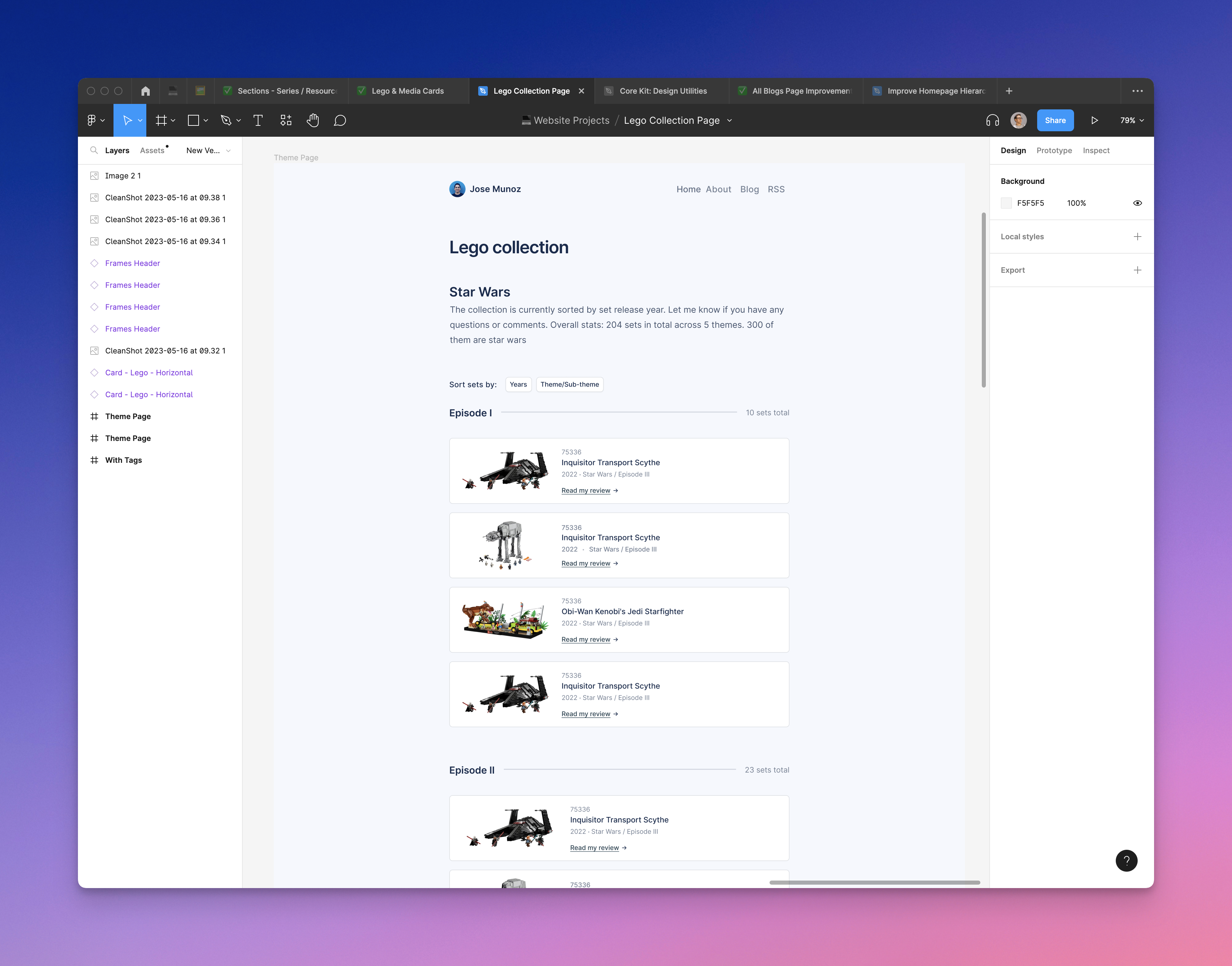
For this tweak, my primary references were Paul Stamatiou's excellent website, one of the few blogs to include images in their thumbnails. I got the idea of grouping the posts by year/month from Manuel Moreale's blogs page. I also referenced Apple's newsroom site.
Deciding on the page information density

In these sketches, I explained the page's different types of information density. From text-only posts, thumbnails are similar to most personal websites and blogs I've seen. To the full-blown cards I had at the moment. I decided to go with an in-between of both approaches by keeping the cards but simplifying the layout.
Recently I've been trying to sketch more for both work and personal projects. Something I read that has internalized with me is that I should reserve sitting at my desk/Mac for doing and executing and not for thinking. I am trying to remember where I read that, but it has been an excellent advice. Before, I just opened an empty Figma file and started working, but I needed a clear direction. On the contrary, when I sketch, it feels like having a personal assistant; I do the thinking and create the plan, and then my "assistant" just needs to sit at the desk, put on a podcast, and do the production work.
I've tested Figjam and Apple's new freeform app. I prefer Figjam's interface and tools, which play so nicely with Figma. But on the other hand, Freefrom's responsiveness when using the Apple pencil is unparalleled. When using Figjam to draw, you can feel a slight delay that messes up the flow state. Although Freeform is very limited in its drawing tools, it's super quick and allows me to focus on the problem.
Designing cards for multiple use cases

I created a component for the main thumbnail card, including all the information I could include simultaneously, like date, title, subtitle, CTA, and image. Then, I'm using Figma's excellent component properties to easily allow me to customize the cards and test for every use case. I also created a nested image component with different variants for different image ratios.
I decided to go with a horizontal layout similar to Paul's site. But I placed the image to the right to better accommodate instances where I don't have a featured image. I want the page to be easy to skim, and by having the image on the right, I can ensure that there will always be a consistent visual anchor with the text on the left.
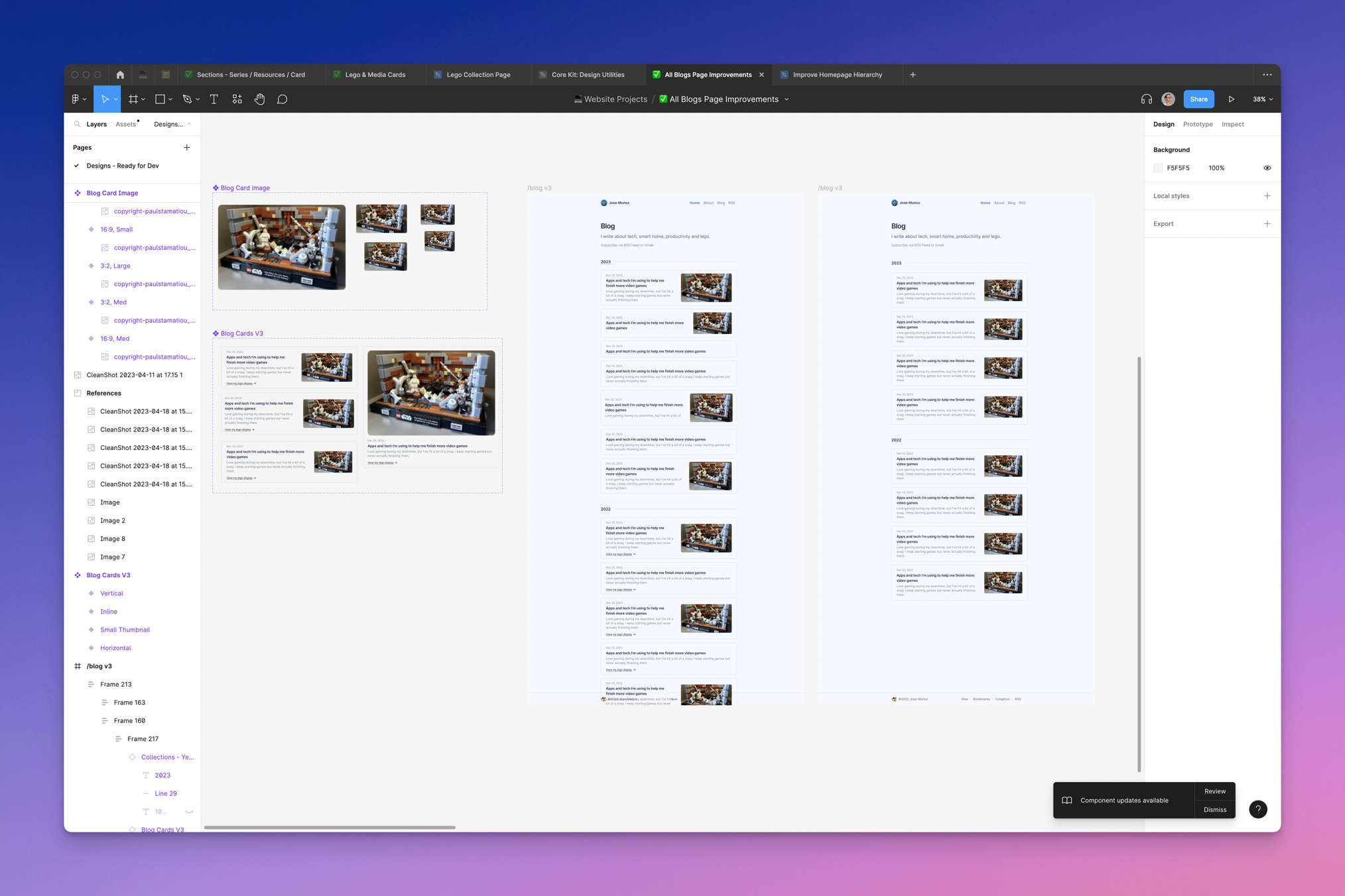
While designing the components, I mocked them up simultaneously on the page to start testing the auto-layout and getting a sense of how it looks. Here is where I tweaked spacing, staying true to my 8-point grid. I also try to use different thumbnail use cases to see how the page would look with a mix of image and image-less posts.
Implementing changes in Weblfow
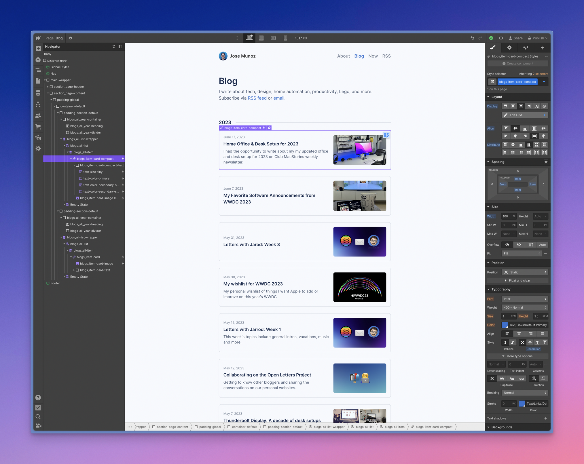
Finally, my favorite part is the dev side in Webflow. The beauty of Webflow is how easy it is to implement changes to the structure or the design. You have the HTML structure on the left panel and all the CSS classes on the right displayed visually.
I just had to create and style the new Year headers and then filter the CMS category to only show posts for the Year, in this case, 2023. As a hack, I created a Reference Field on the CMS to assign the Year to every blog post because the date filter only allows you to filter by relative dates. Then I tweaked the CSS classes for the thumbnail cards to follow the new design.
Let me know if you want to learn more about setting up a blog with Webflow.
Also, making CSS changes is even easier because I built the site following Finsweets methodology.
Closing thoughts
Even if the results feel very simple, it took a while to arrive at this solution. I explored different options but ultimately scratched. The data lover in me feels a bit sad that there is no measurable way to test the effectiveness of the new design, so I will have to rely on my opinion. But still, these types of projects feel very satisfactory, and I love having a site I get to improve over time.
Next, I plan on making a few tweaks to the Homepage hierarchy and categories. Also, I'm still working on the design and backend for my Lego Collection page; stay tuned or take a sneak peek at my Notion backlog/roadmap.


UX Manager at BOLD from Puerto Rico. I write about Apple, smart home, desk setups, and productivity. I also co-run Cuevas Closet with my wife.
Thanks for reading! Subscribe to to get an email whenever I post or subscribe via RSS feed.


